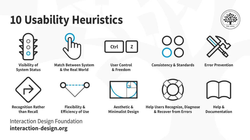
Jakob Nielsen, a pioneer in web usability, developed a set of 10 heuristics in the 1990s that have become the foundation of user interface (UI) design. These principles, now known as Nielsen Heuristics, provide a framework for creating interfaces that are easy to learn, efficient to use, and enjoyable to interact with.
Let’s dive deeper into each of these 10 heuristics and explore how they can be applied to improve the usability of your website, app, or any other digital product:

Visibility of system status
Users should always be kept informed about what’s happening in the system. This includes providing clear feedback on actions taken, progress made, and any potential errors encountered. Imagine driving a car without a dashboard – you’d be completely lost! Likewise, interfaces need to keep users informed through visual cues, progress bars, error messages, and other feedback mechanisms.
System-to-Real-World Match
Speak the user’s language, not your own technical jargon. Use familiar terms, concepts, and metaphors that align with the real world to avoid confusion and cognitive overload. Think of it like translating furniture assembly instructions—they should be clear and understandable, not a cryptic puzzle.


User Control and Freedom
Allow users to navigate and undo mistakes easily. Provide an “undo” function, clear exit paths from unwanted states, and confirm prompts before irreversible actions are taken. Imagine being stuck in a maze with no exit—that’s how users feel when they’re trapped in an interface with limited control.
Consistency and Standards
Maintain consistency in terminology, layout, and behavior across the interface. Users shouldn’t have to relearn how to interact with every element or screen. Think of traffic lights—their consistent color scheme and positioning provide a universal language for drivers, ensuring safety and predictability.


Error Prevention
Prevent errors from happening in the first place through thoughtful design. Use input validation, clear instructions, and prompts to avoid user frustration and wasted time. Imagine trying to fill out a form with confusing or missing fields—it’s a recipe for errors and abandonment.
Recognition over recall
Minimize the need for users to remember information from one part of the interface to another. Provide clear labels, hints, and search functions to help users find what they need without mental gymnastics. Imagine searching for a document in a messy filing cabinet—it’s much easier when everything is labeled and organized.


User Flexibility and Efficiency
Cater to a variety of users with different levels of experience and skill. Provide shortcuts for advanced users while keeping the interface simple and intuitive for beginners. Think of a pair of adjustable crutches—they should support someone recovering from a sprained ankle as well as an experienced climber.
Aesthetic and Minimalist Design
Focus on clarity and usability over unnecessary frills. Keep your interface clean, organized, and visually appealing without distracting users from their goals. Imagine a cluttered desk versus a clean, organized desk—which is more conducive to getting work done?


Help users with errors
Provide clear, helpful error messages that explain what went wrong and how to fix it. Offer suggestions for corrective actions and avoid condescending or blaming language. Imagine getting a cryptic error message on your computer—it’s as frustrating as getting lost in a forest without a map.
Help and Documentation
Even the best interfaces can benefit from well-written documentation and support resources. Provide easy access to FAQs, manuals, tutorials, and contact information for when users need extra help. Imagine assembling a complex piece of furniture without instructions—it’s much easier with a clear guide.


By applying these 10 heuristics, you can create interfaces that are not only usable, but also enjoyable to interact with. Remember, the goal is to make users feel confident, in control, and successful in achieving their goals. So next time you’re designing an interface, ask yourself: “Is it easy to use? Does it follow the principles of the Nielsen Heuristic?” By putting your users first, you can create products that they’ll love to use.
I hope this detailed explanation of the Nielsen Heuristic was helpful. Props to interaction-design.org for icons. Comment below if you have any questions or concerns!
